

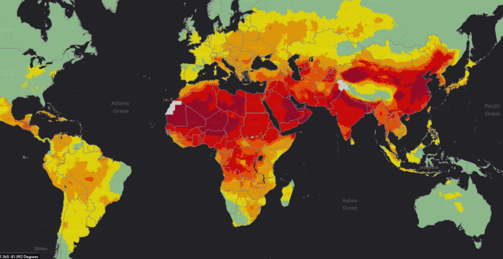
WORLD MAP OF AIR QUALITY AND POLLUTION LEVEL
This map visually shows us global air pollution levels, with color intensity indicating higher degrees of pollution—red and dark orange signifying the most polluted regions, yellow indicating moderate pollution, and green for areas with clean air and veryhealthy for humans to live.
The pollution pattern on the map reveals a strong connection between industrial and economic activity and the distribution of big numbers of pollution, offering insight into the environmental costs of prosperity.
Africa
Most of North Africa, including the Sahara region and its neighboring countries, displays intense red zones, reflecting very high levels of air pollution. This goes way long through West and Central Africa, reaching into parts of East Africa. These high pollution levels often relate to population density, rapid unplanned urbanization, low-regulation industrialization, and natural sources such as dust storms. Southern Africa, by contrast, is dominated by lighter green and yellow zones, corresponding to lower pollution levels, likely due to less dense population centers and less industrial activity.
Europe
Europe shows a clear north-south gradient. Northern and Western Europe generally enjoy lower pollution levels, seen in the lighter green coloring. Central and Eastern Europe develop more yellow and orange regions, indicating moderate pollution where industrial activity and dense urban populations are more common. However, even Europe’s more prosperous regions, through advanced technology and environmental regulation, have managed to lower overall pollution despite high economic output. Example of Europe shows us that the right decisions taken by governments can easily reduces the amount of pollution.
Asia
Asia, especially Central, South, and East Asia, is the most pollutes area in the world, with fierce concentrations in northern India, eastern China, and parts of Southeast Asia. This corresponds with regions of economic boom, industrial growth, high vehicle density, and urbanization. It’s example are given below:
- Northern India’s Indo-Gangetic Plain and eastern China (including Beijing and Shanghai) are some of the world’s economic engines and also have the worst pollution due to coal-fired power, factories, and dense cities.
- Southeast Asian urban centers like Bangkok and Jakarta also reflect this trend, though tropical regions and remote areas remain less polluted.
North America
In North America, the map shows mostly green across Canada and the rural United States, denoting clean air. However, parts of the eastern U.S., Mexico, and Southern California demonstrate yellow or orange, reflecting areas with significant economic activity—dense transport networks and industries leading to higher emissions. Also the right decisions taken by governments have easily reduced the amount of pollution overall.
South America
The Amazon and much of Southern South America remain moderately polluted, with pollution spiking in more urbanized and industrial regions like southeastern Brazil. Economic prosperity linked to urbanization and development in cities such as São Paulo and Buenos Aires manifests in increased pollution, but large rainforest regions help offset these effects.
Australia
Australia is mostly green, denoting low pollution, with exceptions in small urban pockets where economic activity is concentrated. This pattern demonstrates that wealth does not always directly translate to increased local pollution, especially if strict environmental controls are in place, as in Australia.
The Link Between Economic Prosperity and Pollution
The global pattern is clear: the world’s industrial powerhouses—China, India, and parts of Europe and North America—are hotspots for air pollution, directly reflecting their economic output and energy demand. Prosperous regions attract more people, vehicles, and industries, which leads to higher emissions. However, the wealthiest nations often have more resources to mitigate pollution using technology, regulation, and cleaner energy.
In contrast, emerging economies sometimes struggle to balance economic growth and environmental protection, resulting in worse air quality.
The map, therefore, is both a snapshot of current pollution and a story of how humanity’s pursuit of prosperity inevitably shapes the planet’s air quality—with developed and rapidly developing regions most affected, but wealthy nations increasingly able to combat their pollution burden through policy and innovation.